Packaging and Merchandising: Assignment 1
October 12, 2018Week 3-Week 6
Beatrix Leong Yi Wen
0331043
Packaging and Merchandising
Assignment 1
Instructions
Lectures
Week 3
In Week 3, Chia Ying, Cherine and Arif gave a lecture on the Purpose and Function of Packaging. They explained the many uses of packaging such as storing food, preserving food, displaying food, etc. They also explained about the primary, secondary and tertiary functions of food. Primary being features such as storing, transporting and displaying products, while secondary functions refer to sales and promotion of the product, while lastly tertiary refers to the recyclebility of the packaging.
Week 4
In Week 4, Chloe, Kathryn and Vicky gave a presentation on the types of packaging and materials available in the design field. They told us about primary, secondary and tertiary packaging and the different types of materials and packages used in each level. Primary packaging refers to the bottles in which drinks are stored in. Secondary packaging refers to the cartons (six packs, etc) the drinks can be sold in bulk. Tertiary packaging is rarely seen by consumers, and it would refer to the drinks would be packed in for transportation purposes.
Week 5
In Week 5, Chloe, Kathryn and Vicky gave a presentation about Merchandising Design. Merchandising is the promotion of the sale of goods that can employ pricing, special offers, display and other techniques designed to influence consumers’ buying decisions. Merchandising refers to the variety of products available for sale and the display of those products in a way designed to stimulate customers. The key elements for Merchandising Design are colour, landscape, decor, texture and communication.
Week 6
In Week 6, Cherine, Chia Ying and Arif created a lecture about trends in Packaging Design. First, they began by telling us the benefits and importance of good packaging design and its function. Next, they explained and showed us examples about current packaging trends which include:
- Simplicity
- Pastels
- Doodles
- Movie posters
- Big words
- Unique shapes and materials
- Vintage
- Photography
- Holographic effects
- Vibrant gradients
Progression
First, I started out researching more about Juscool's sparkling drinks by checking out their website. I decided I wanted to go for a look and feel that was fun and relevant yet trendy which was what I felt was missing in their current packaging design. I began by researching different drink packaging designs and creating a moodboard on Pinterest (link available below):
Research:
 |
| Moodboard |
Sketches:
Then I proceeded with sketching out the design and redesigning the Juscool logo.
 |
| Logo sketches |
 |
| Logo sketches |
 |
| Initial sketches |
 |
| Final concept sketches (flat design) |
Drafts:
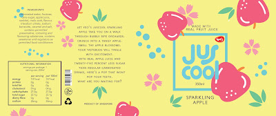
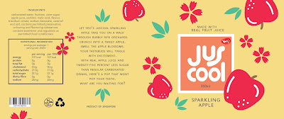
After sketching, I decided to go for a flat design look with a "juicy" looking logo to go with it. Next, I began to create the label digitally. I came up with many layout and colour variations.
 |
| Design variations |
 | |
|
 | |
|
 | |
|
 | |
|
 | |
|
Feedback
The designs seemed a bit cluttered and Mr Shamsul commented the colour scheme was not interesting enough and there were too many apples, so I worked on simplifying the design and improving the colours.
 | |
|
 | |
|
 | |
|
 | |
|
 | |
|
Feedback
Mr Shamsul commented that it still doesn't look interesting enough. So, I experimented with making the background more interesting, and simplifying the elements, as well as adding a shadow to the Juscool logo.
 |
| Exploration |
 |
| Exploration |
 |
| Exploration |
Feedback
Mr Shamsul commented the last one with the blue and purple background was the best, which is what I developed into the final draft:
Final draft:
 |
| Final label |
Application:
Next, I printed it out on a real bottle and created a background for it.
 |
| Product with background |
The top part is too empty and not aligned. the top should be aligned and change the hierachy of information . top = juscool (make bigger), middle= "made with real fruit juice" bottom= "sparkling apple". The apples don't show in the mock up picture and the nutrition label should be in a white box.
Reflection:
Experience:
Creating our own label design was certainly a challenging experience, but it was really interesting from researching our given drink and examining the current product design to see which elements are important and what can be improved. The process has been a very enlightening one.
Observation:
I observed that not necessarily more elements would equal to a better design, sometimes a simple well thought out idea would be better than a complicated one that doesn't make sense. I noticed that design takes many drafts to perfect a concept and improve it.
Finding:
I found that my appreciation for packaging, especially drink packaging has improved with this assignment. I am more sensitive to good and bad packaging design and find myself observing different drink packaging in cafes and grocery stores. I also find that my understanding of flat design has improved with this assignment.


0 comments