
Typography & Hypertextuality: Project 1, Exercises
April 16, 2017
28/3/16 – 24/4/17 (Week 1 – Week 5)
Beatrix Leong Yi Wen, (0331043)
Typography and Hypertextuality
Project 1: Exercises
Beatrix Leong Yi Wen, (0331043)
Typography and Hypertextuality
Project 1: Exercises
Introductory Lecture || Week 1, 28/3/2017
During our first day of class, our lecturers Mr Vinod and Mr Shamsul introduced us to the concept and meaning of typography, as well as its long history in human civilisation and culture. We were also briefed on the aims of this class and the work we were expected to undertake for this semester.As a class activity, we were split into groups and asked to research a particular traditional calligraphy hand and present our findings on it to the class. My group chose Uncial (Figure 1).
 |
| Figure 1: Uncial |
The first lecture gave us an overview and an understanding what typography is and how we would be approaching it ourselves.
Lecture 1 || Introduction to Typography, Week 2, 4/4/2017 \
I was absent for this lecture due to having a flu; I caught up by reviewing the lecture notes online and asking my classmates what we covered. We learnt about how typography is used in everyday life and what fonts, type faces and type families are. We started more work on our exercises this week. We chose a calligraphy hand and started practicing writing letters, working up to the final piece of writing a quote in calligraphy.
Lecture 2 || Typography Basics, Week 3, 11/4/2017
We started this week by learning in more detail about the theory of typography. We learnt about glyphs, the anatomy of typography (such as x-height, baseine, cap height and so on), uppercase/lowercase numbers and more on typefaces. After this, we went straight into practical work. We were asked to design a typeface for our name- like a sort of personal logo.
Lecture 3 || Development/Timeline of Typography, Week 4, 18/4/2017
In today's class we started off by learning more about the history of typography. Phoenicians, where lettering was first born, wrote from right to left. Greeks changed this order by reading from right to left, left to right and right to left again while mirroring text as well. This was known as "boustrophedon" or "how the ox ploughs".
 |
| Figure 2: Greek reading order |
Later, the Greeks or Phoenicians changed their reading style again to the left to right order that we (thankfully) use today.
After the lecture, we presented and viewed our name lettering animation work, gave feedback to our peers while receiving feedback in turn from them and Mr Vinod.
Instructions:
The Brief
Exercises.
Duration of Assignment:
4 Weeks (Briefing on Week 1)
DEADLINE
Week 5 (25 Apr 2017)
Description
Throughout the beginning and the middle of the semester, exercises will be prescribed at various phases of the module. These exercises will aid and benefit you in your quest to gain theoretical and practical knowledge in Typography that will inform you and provide you with the necessary experience to take on the module’s projects.
All exercises prescribed are to be completed and documented (labelled, clean, clear & concise) in your eportfolio and Hardcopy portfolio respectively.
The exercises are as follows:
All exercises prescribed are to be completed and documented (labelled, clean, clear & concise) in your eportfolio and Hardcopy portfolio respectively.
The exercises are as follows:
1) Calligraphy
2) Lettering
3) Type Expression
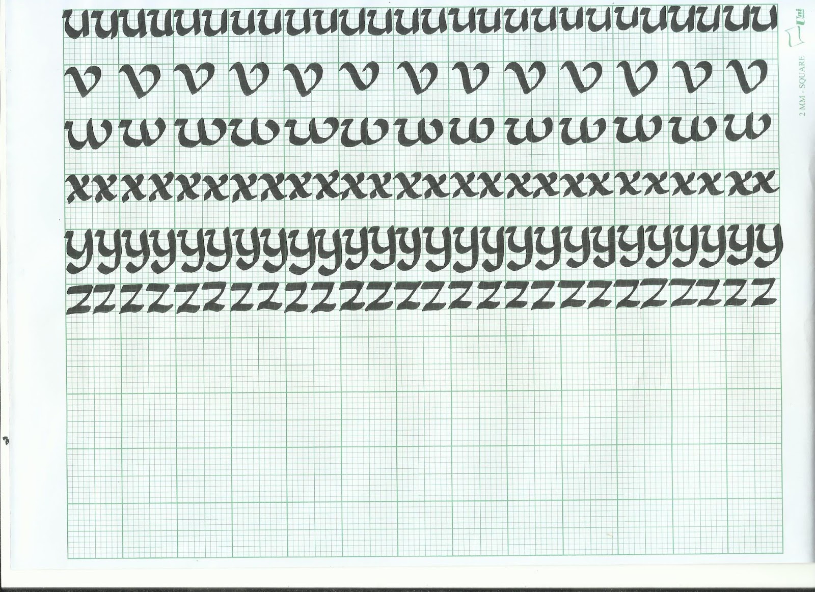
Calligraphy: You will choose a calligraphic hand (Round Hand, Black Letter, Uncial). You will complete the prescribed exercises (vertical lines, horizontal lines, circular lines and letters a–z). Upon completion of the prescribed exercises, you shall write a small 3 or 4 line passage/poem. You have 2 weeks for this exercise; it is to be done in class and at home. (2 weeks).
Lettering: Draw out the letters of your name (first name or nick-name). Try to capture your personality or character in the design of the letters. Using the appropriate software, animate the drawn out letters while ensuring the animated gif stays within the character and personality. (1 week).
Type Expression: You will be given 6 words to compose and express. You will be given a set of typefaces to work with. Through iteration, use the appropriate typeface and compose the letters in a manner that allows meaning of the word to become visible. (1 week).
Requirements
To complete and to showcase mastery in the exercises prescribed in its various forms over the 13-week period. This process is repeated for all 8 weeks. The work is compiled logically and chronologically in an A3 clear sheet folder and documented on the students’ eportfolio.
Submission
1. Exercises to be documented in an A4 Clear Sheet folder, logically and chronologically. The works must be labelled and dated.
2. Eportfolio posts at the end of the assessment task labelled and dated, with images captured well and in good light in so that the works are pleasing to the eye and legible.
Objectives
1. An appreciation and understanding for the evolution of Typography.
2. An appreciation of the skills sets and mental discipline required in Typography
3. To develop the necessary software skills for the typographic communication.
Exercises || Calligrapghy
Our homework was to practice drawing lines and circles on graph paper to practice our calligraphy strokes.
 |
Figure 3: Vertical lines
|
 |
Figure 4: Horizontal lines
|
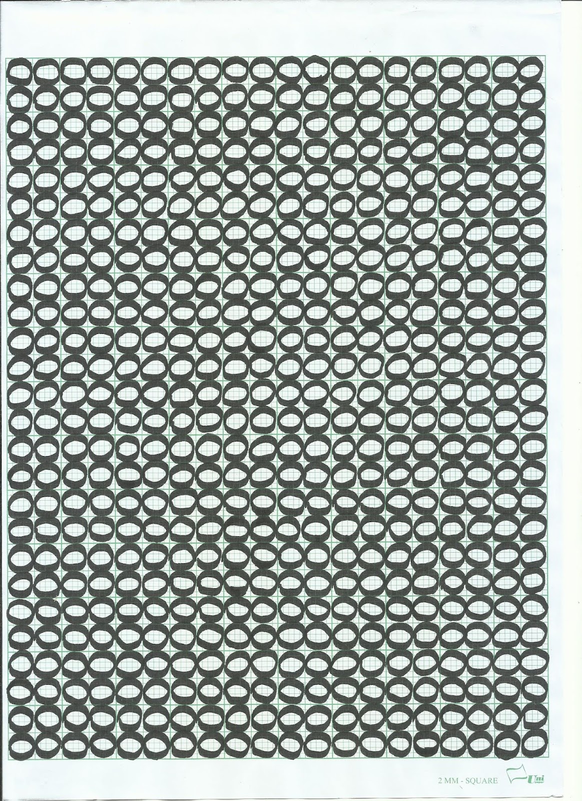 |
Figure 5: Circles
|
 |
Figure 6: Initial practice
|
I chose Uncial and my final quote was from the BBC TV series Merlin, "There is no evil in sorcery but only in the hearts of men".
 |
| Figure 7: Writing alphabets |
 |
| Figure 8: Writing alphabets |
 |
| Figure 9: Writing alphabets |
 |
| Figure 10: Initial alphabet practtice |
 |
| Figure 11: Initial alphabet practice |
 | |
|
After a great deal of practice, I began to start on the actual quote. I played around with the wording arrangements until I was satisfied and confident enough to start on the final piece.
 |
| Figure 13: Initial quote practice |
 | |
|
 |
Figure 15: Final work (There is no evil in sorcery but only in the hearts of men -Merlin BBC)
|
Exercises || Lettering
We were asked to design a typeface for our name- like a sort of personal logo. First, we drew sketched it out manually.
I came up with a few but eventually went for the crystal themed one. We then traced it in Illustrator, first as a still image (Figure 17).
We then were taught to animate it first in In Design, and then in Photoshop. Mr Vinod and Mr Shamsul eventually recommended us to use Photoshop's frame animation as it was more suitable for this exercise. In class, this was the animation I produced:
I was not entirely satisfied with this and since we were told to improve it at home if we needed to, I worked on it by adding some details to the "A" to have a more crystal-like "shine" to the wordings and animate it in a motion that seemed more pleasing and fitting. Hence, the animation below:
 | |
|
I came up with a few but eventually went for the crystal themed one. We then traced it in Illustrator, first as a still image (Figure 17).
 |
| Figure 17: Name lettering |
We then were taught to animate it first in In Design, and then in Photoshop. Mr Vinod and Mr Shamsul eventually recommended us to use Photoshop's frame animation as it was more suitable for this exercise. In class, this was the animation I produced:
 |
| Figure 18: Initial name lettering animation |
I was not entirely satisfied with this and since we were told to improve it at home if we needed to, I worked on it by adding some details to the "A" to have a more crystal-like "shine" to the wordings and animate it in a motion that seemed more pleasing and fitting. Hence, the animation below:
 |
| Figure 19: Improved name lettering animation |
Based on the feedback I received, I chose to further improve my name lettering animation.
 |
| Figure 20: Name lettering artboards 1-9 |
 |
| Figure 21: Name lettering artboards 10-18. |
 |
| Figure 2: Refined final name lettering animation |
I changed quite a number of components in my animation. I made the crystals "shimmer" by alternating the lines with black and light grey for a flickering effect, added shine lines to the letter "I" as well for a more balanced look as there was unnecessary emphasis on just the "A" before. I also changed the way the lines appear for a more lively and dynamic look. I also made the shine lines pulsate to emphasis the shine of the crystals. Finally, I scrapped the one-by-one letter entrance as it was quite common and Mr Vinod told us it wasn't necessary to make the letters move all over for our animation to be effective.
Exercises || Type Expression
As a class, we came up with six words we had to animate in Photoshop, illustrating their meaning without adding material/graphics or distorting the letters. These six words were kick, jump, sleep, hunt, throw and fart. First, we sketched out our ideas of still images of the words.
 |
| Figure 23: Sketching the six words |
\
 |
| Figure 24: Digitalising our sketch |
I started animating "throw" but Mr Vinod said "throw" would be too easy and advised me to try "fart" as well. Thus I ended up with two animations, of which "fart" is the better and final one:
 |
| Figure 25: Throw artboards 1-9 |
 |
| Figure 26: Throw artboards 10-16 |
 |
| Figure 27: Fart artboards 1-9 |
 |
| Figure 28: Fart artboard 10 |
 |
| Figure 29: "Throw" Lettering Animation |
 |
| (Final Verb Animation) Figure 30: Fart Lettering Animation |
Feedback ||
Week 1:
When we were presenting, Mr Vinod pointed out that some of our facts didn't add up such as the dating of the font and the era it was used. It was a good opportunity for us to remember to check our facts more thoroughly in future.
Week 2:
Horizontal lines generally good but strokes are a little wobbly. Spaces between vertical lines needs to be more consistent. Circles are consistent and fairly neat, thick and thin lines are visible.
Week 3:
Regarding the practice ABCs, generally good work but "a"s and "b"s are a little messy. Some letters are more consistent than others. Lettering is improving as it goes along. Quote practices show progress. Final work is nice and looks "laser printed". However "e" should not have been gone over a second time.
Week 4:The feedback I received for the GIF I posted under week 3 for the design and animation was:
- good design
- good complex line work
- could be interpreted as either crystals or pencils
- crystals could maybe have less parallel/straight lines (either make it tapering in or flaring out) so that they won't be mistaken for pencils
- or could be double pointed for the same purpose as above
- do more shine-lines
- animate lines to make them appear and disappear
- make the lines move to indicate the crystal shimmering
- animation style of how the letters appear is generic and doesn't fit the style of lettering
And for the verb lettering and animation:
- good choice of fonts, especially for "sleep"
- good work and ideas in general
- "fart" is especially good
- yet to receive feedback on the verb animations specifically.
- yet to receive feedback on the final revised name animation.
"Sleep" looks more like it's falling than sleeping. The rest of the verbs are good, but maybe for "hunt" the spaces between the letters should be even and for "kick" the lines behind the i-dot are too thick. For the "throw" animation, it's animated well but the word as a whole is moving around which it shouldn't. The throw action however looks more like a passing rather than throwing.
Reflection ||
Experience:
This class has been different from others so far in the sense that we do most of our work and assignments in class under the supervision of Mr Vinod and Mr Shamsul. This is helpful as we can receive help and feedback immediately and have a lesser workload to take home.However, the six hour long class is extremely taxing and exhausting. The workpace we are expected to keep up with is fast-paced to say the least. If I were to say more I'd say it often makes me feel I've been shoved into a fast-forward time machine.
This class has been different from others so far in the sense that we do most of our work and assignments in class under the supervision of Mr Vinod and Mr Shamsul. This is helpful as we can receive help and feedback immediately and have a lesser workload to take home.However, the six hour long class is extremely taxing and exhausting. The workpace we are expected to keep up with is fast-paced to say the least. If I were to say more I'd say it often makes me feel I've been shoved into a fast-forward time machine.
Observation:
I noticed that it is absolutely necessary for me to write down the steps for whatever new Photoshop or Illustrator magic we learn or else I will forget it almost instantly. I noticed that I can get a lot of work done in the six hour period, probably because there are not many distractions in class.However I noticed my productivity plummets quite drastically once we get to the fourth hour and close to zero during the fifth hour, probably because I'm tired already and can't work and think as effectively.
Findings:
I find that I need to be better with time management so I won't have to stress out doing last minute work, which affects the quality of the work I produce. I also need to label and record my work consistently.
So far, I find Typography to be a really interesting subject and I particularly enjoyed calligraphy, as I expected to be bad at it (as I have horrible handwriting and am not the neatest person around) but in the end my work turned out pretty well and received positive feedback.I feel that I have learnt a lot about lettering, calligraphy and typography that will be very useful in future design projects.
Books:
 |
Figure 31: Design: Type by Paul Burgess/Burge Agency
|
- minimal designs/typefaces are often the most effective
- it is very important to consider the purpose of the type and if it would be suitable for the purpose and audience or not (eg. kids' books, corporate work, album art covers, etc)
- one should try to follow the rules of typography and know them well before breaking them and experimenting; however it is necessary to eventually break the rules with something groundbreaking to be successful
- handlettering type is making a comeback in this technological age, giving a human element to previously computer dominated types and reflects the history of typography before computers took over everything
- it is important to study many styles of art but most especially styles and artists relevant to your own work.
 |
| Figure 32: Typographic Systems by Kimberly Elam |
Another book I borrowed was Typographic Systems by Kimberly Elam. The book, as its name suggests, focuses mainly on typographic systems, which the different systems type can be arranged in shapes. These are:
- Random system: elements and type seem to have no specific relationship with each other or pattern.
- Grid system: somewhat following the rule of thirds, a system of vertical and horizontal lines forming divisions
- Transitional system: An informal system of layered banding
- Modular system: A series of elements that are clumped into groups, or "units"
- Bilateral system: All the text elements are arranged symmetrically on one axis.
- Radial system: Text extends from one point of focus, like a starburst pattern.
- Axial system: Text elements are either aligned to the left or right of a single axis.
- Dilatational system: Text elements expand from a central point like the radial system, however for the dilatational system the text expands in a circular fashion rather than a linear one.
The book emphasises that most designers will typically utilise the traditional grid system, and are unaware of the potentials the other systems offer to the design world. If the other systems are explored and used, it could expand design work siginificantly.
I found the concepts of the different systems fascinating as I had no idea they existed. I intend to renew this book as I feel the information on the different systems will come in handy for our upcoming assignments.


0 comments