Entertainment Design: Week 1
February 04, 2020Presentation Skills
Mr Mike showed us a riveting video by Don Mc Millan. It was a video that explained the do's and don'ts of presentation slides. Presentations shouldn't have long blocks of text. They should contain plenty of images and pay attention to typography. Symbols should be used too to attract and engage the audience. Infographics are also a good way to present information to the audience in an engaging way that connects with them. Pay attention to structure. Lastly, make it original.
History of Matte Painting
Matte painting involves the iconic greenscreen. But before the greenscreen was used, a scenery or landscape would be painted onto a pane of glass. Nowadays, the image is digitally transposed onto the greenscreen. When creating a matte painting, photobashing is normally used. This is when two or more pictures are digitally combined to create a surrealistic new one. The rule of thirds and golden ratio should also be considered when composing the matte painting.
 |
| Example of modern matte painting |
 |
| Traditional Matte painting |
 |
| Rule of thirds and golden ratio |
Key Art
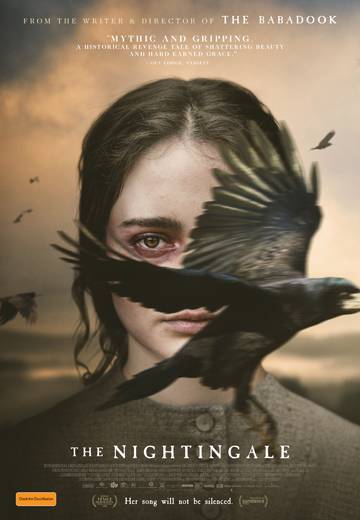
Key art refers to a single iconic image of which movie campaigns and merchandise are built. They are supposed to stir interest and/or recognition with the audience. It can be an actor, character, object or symbol.
 |
| Key Art |
 |
| Key Art |
| Key Art |


0 comments